Newly “adjusted” satellite-derived temperature data shows much more warming in the bulk atmosphere than previous data, but shows the Earth’s atmosphere is still cooler than most climate models projected.
“It’s not that big a change, and it’s still controversial and new,” Chip Knappenberger, a climate scientist at the libertarian Cato Institute, told The Daily Caller News Foundation. “It’s still not coming close to explaining the discrepancy between the models and the observations.”
A new version of Remote Sensing Systems (RSS) satellite data, run by climate scientists Carl Mears Frank Wentz out of Northern California, shows much more warming than other satellite and weather balloon measures of the mid-troposphere.
RSS data now shows 0.125 degrees Celsius of warming per decade — a great deal more than the 0.078 degrees per decade it previously showed. NASA’s top climate scientist even suggested this could mean the end of the more than 18-year “pause” in the RSS data.
Skeptics took notice of the change to the RSS warming trend and  pointed out that Mears and Wentz did not correct for discrepancies between two different National Oceanic and Atmospheric Administration satellites relied on to collect data which is then converted into temperature readings.
“We’ve looked at their new results versus our data, and it does appear that the new warming they’ve ‘found’ is just spurious warming in the old (poorly-calibrated, and orbit time-drifting) NOAA-14 MSU instrument, which they leave in the data analysis,” Roy Spencer, a climatologist at the University of Alabama in Huntsville, told TheDCNF.
“We remove that spurious warming since it disagrees with the newer (better calibrated, non-drifting) NOAA-15 AMSU instrument flying at the same time,” Spencer said.
Mears also wrote on his website he was getting a lot of questions from those worried “denialists” were using his satellite data to cast doubt on global warming, which has some skeptics worried he’s looking for an excuse to find warming.
“I suspect Carl Mears grew tired of global warming ‘denialists’ using the RSS satellite data to demonstrate an 18-year ‘pause,’” Spencer said. “So, now that problem is solved.”
Spencer went into further detail about why he thinks Mears’ new data is adjusting good data upwards to meet bad data in a blog post Friday.
Mears, however, argued the “spurious warming” in the new data is from overlapping satellite coverage of the atmosphere. Even if they wanted to make the correction Spencer argues for, Mears says it doesn’t make much of a difference in the overall trend.
“We do not know if the problem is due to NOAA-14 or NOAA-15,” Mears told TheDCNF. “If we assume that all the drift is due to NOAA-14, as Dr. Spencer would like us to do, we can eliminate the use of NOAA-14 after 1999 so that its (potentially erroneous) trend during the overlap period does not affect the overall results.”
Mears noted there’s “no evidence that NOAA-14 drifts for time periods before 1998” as it agrees with other satellite measurements made over the ocean. Mears said: “So we can not assume that the problem is with NOAA-14.”
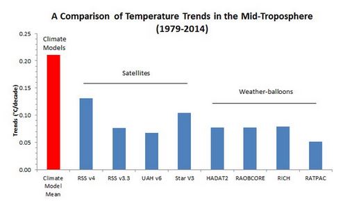
It’s a rather technical debate over how scientists go about making adjustments to satellite-derived measurements to get global temperature estimates. But what’s gone overlooked by some in the debate is that even the newly-adjusted RSS data is well-below what’s been predicted by climate models.
“Even the new RSS trend is barely half the model trend,” Knappenberger told TheDCNF, adding that the RSS data is “now the outlier compared to all the other data sets.”
Knappenberger even created a chart showing just how far below new RSS data is from climate model predictions (above).
The new RSS data runs much higher than UAH satellite data, run by Spencer and Dr. John Christy, which only shows a warming trend of 0.072 degrees Celsius per decade. RSS also runs hotter than weather balloon data, which show about the same or less warming than UAH data.
Follow Michael on Facebook and Twitter
This article originally appeared in The Daily Caller
Isn’t it cool, or hot rather, that even the UAH satellites show February 2016 was the warmest February ever recorded, and broke the record by the greatest margin, nudging out the last exceptional anomaly, January 2016. And this on the tail of 2015 being the warmest year ever recorded, that having broken the record set in 2014. When will CFACT ever see facts?
because the troposphere has a well known 6 months lag with el nino?
the surface always responds faster to an el nino then the troposphere.
The 2015 el nino year was the hottest on surface temp but not on the satellite graph (it ranked 3rd) but they expect 2016 will due to the known lag.
And you explain this EN being warmer than the last, and that one being warmer than the previous . . . . how?
And since satellites measure only electrical impulse from assumed IR photons coming from 0-18km including both warming troposphere and cooling stratosphere . . . what the fuck is your point.
What will they say if 2016 is warmest in both surface and LT? Cooling coming soon?
Best,
D
They will say – adapt.
Fibbin Bastasch called out on his fibbin already.
Best,
D
An honest look at the trend, rather than using paid shill Knappenberger:
https://pbs.twimg.com/media/CcuCA45UsAAWZhg.jpg
Note also the range of uncertainty in satellite data. Something will have to be done to address it.
Best,
D