Take this article:
https://www.theguardian.com/world/2022/apr/13/hurricanes-atlantic-climate-change-tropical-cyclones
Here is the headline, “Extreme Atlantic hurricane seasons now twice as likely as in 1980s”.
Now, why is that not the big deal it’s portrayed to be?
First of all, if the truth is good, what is hiding the truth or an outright lie? Is that not evil?
But let us acknowledge the good. If the Metric is the number of named storms, this is spot on right.
If its total accumulated cyclone energy (ACE), again they are right,
But here is where the hiding comes in; the whole story is not told.
What is the definition of extreme?
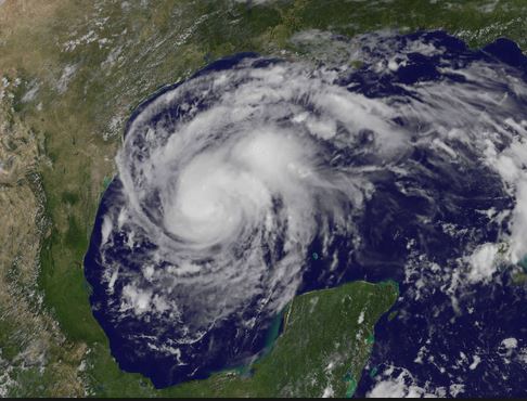
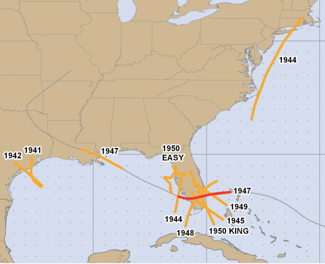
This is why I have constantly been trying to push the ball forward with the power and impact scale. Betsy and Ida for instance were category 4, but the radius of hurricane-force winds with Betsy was 2x Ida. Same as Carla vs Harvey. The 1938, 1944, and 1954 storms were monsters compared to lets say the most recent East coast runner, Irene. Think about how no long-tracked storm in the past 10 years has reached the US coast near its peak. You may say Irma, but Irma at Naples was not as strong as it was in the keys and nowhere near Donna, which then proceeded to be a major all the way up the east coast ( you will see that in the chart below). Matthew, Dorian, and Florence were falling apart as they reached the US. And I have written many times on why this may be the case of a “positive” if you will, of the warming.
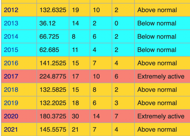
Is it the total ACE index? Well the last 10 years certainly wipe out the 1980’s.
But the 1970s and 1980s WERE THE LOW POINT OF ATLANTIC HURRICANE ACTIVITY. Let’s dig a bit further.
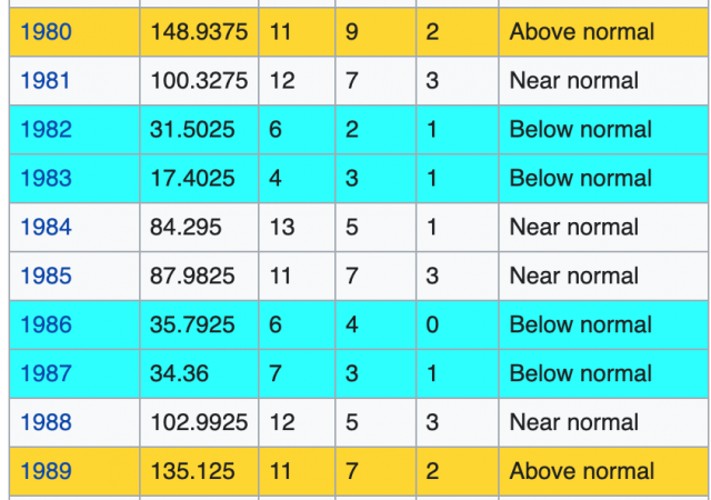
We had a total of 93 cyclones in the 1980s with a total ACE near 800 or 8.6 storm.
What about the last 10 years? Well its a bit over 1300. That is a big increase, but not twice as much. How about total storms close to 160? What about ace per storm, 8.125?
So the average storm was actually stronger in the 1980s.
They do the same thing with the wildfire game.
If you start acreage burnt from Wildfires in the 80’s, its been going up. But its nothing compared to what used to go on.
Here is how they play the wildfire game:
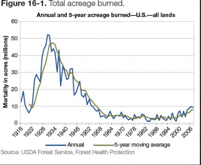
They dont tell you what was going on when CO2 was much lower.
How about the 1980’s? There were only 4 major hits. But what of the 1950’s and 1940’s? Just like they pull with wildfire data, or sea ice data—conveniently comparing it to a period they can pick on—they avoid referring to what happened before (when by the way CO2 was much lower and technology to detect storms was much lower).
Recently, a 2011 paper was published in the AGU (American Geophysical Union) letters on how the global activity is going down overall:
https://agupubs.onlinelibrary.wiley.com/doi/full/10.1029/2011GL047711
The last 2 years in the tropical west Pacific have had low ACE and low impact. Interestingly, one area goes up and the other down. How about that? And since the west pacific is a far more important contributor to the global ACE and basically a source region for the world’s climate patterns, I would say that extreme the other way deserved more examination than the smaller Atlantic.
Now lets look at the 1940’s:
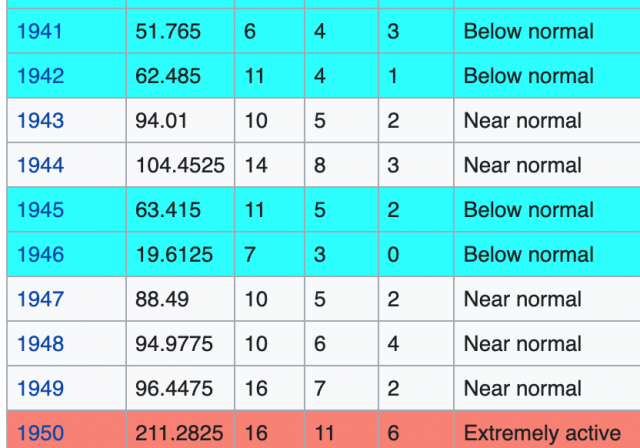
With the exception of 1950, a normal to below average ACE. The total ACE was close to 900.
Known storms about 110. ACE per storm a tad over 8 (not far from the last 10 years). But look at how many major hits, especially on Florida!
It’s like a road map of a city for goodness sakes. Is that more extreme? Arguably it is, as far as impact. And is that not the most important metric, life and property? Think about what would happen if you saw a 10 year period like that on Florida now. Let’s put it in perspective. Remember these are decadal.
2001-2010. This decade had climate hysterics saying we were doomed. But it was less than the 1940’s:
.jpg)
And certainly less than the 1950’s:
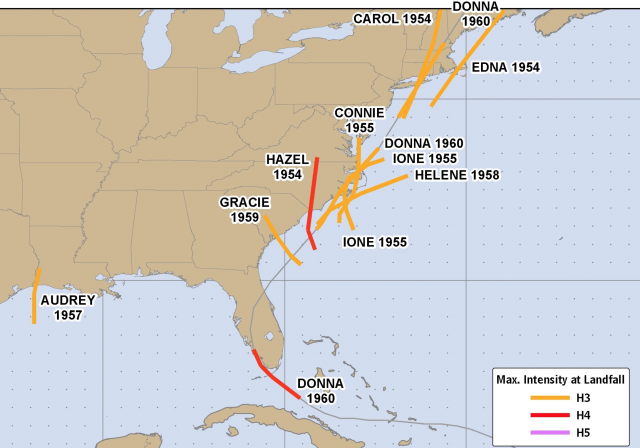
At least the tracks were spread out in the 40’s. They picked on Florida, then the east coast in the 1950’s.
1950’s ACE:
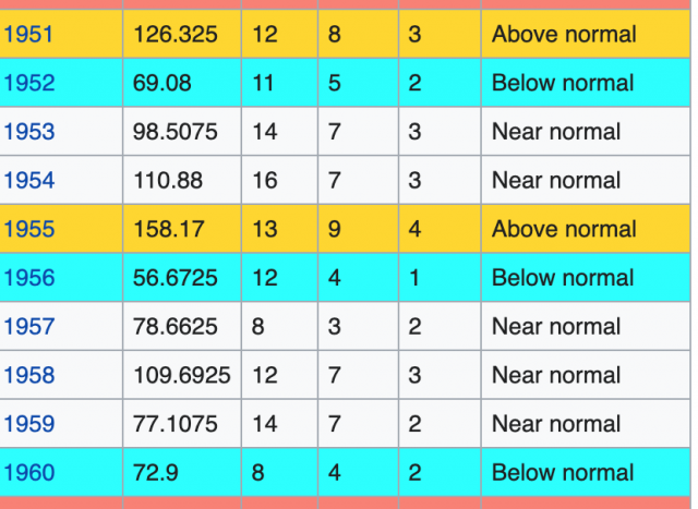
The ACE/storm is around 8.
Overall ACE/storm is NOT INCREASING. And if anything, more majors and many of them longer tracked were reaching the US. The genre of the storm of late is in close development, reaching its peak at the coast, occurring mostly in phases 2/3 of the MJO and being smaller in size.
But what the Guardian did in this article was unintentionally make both the points I have been pushing for over a decade now:
1) The Saffir Simpson scale was a nice start, but something like my power and impact scale describes far better the magnitude of a storm,
2) There needs to be a redefining of the evaluation process for storms, a 2 tiered season if you will as there are many storms now named that could not have been seen before,
3) Go back and reanalyze all land falling storms using the power and impact scale, which incorporates the size of the storm. That should be a nice long research grant!
4) The political slant has to be eliminated. For instance, it does me no good. Business-wise to tell people the weather is not getting worse (bad weather), drives the weather business. The media has picked up on this. But if we are talking about trying to evaluate an entire picture, or for instance a global conclusion, you can’t “censor” by omission or by demonizing others that may have ideas that would question yours. That is a form of scientific despotism. No one has a monopoly on nature and the problem is that with something as eye-opening as a named storm with an eye, there are those that seek to convince the world they do.
That it is for another reason, other than truly defining the problem and seeking the answer (NOT JUST YOUR ANSWER) is demonstrated here.