
The latest State of the Climate Report is out to scare everyone with plucked esoteric records based on dubious datasets adjusted with secret algorithms.
 The star of the report is the 1.5 degrees of Australian “hockeystick” graph of warming (below). The Herald Sun calls it “Scary”.
The biggest crimes of this report are what they don’t say. The CSIRO and BoM must know, but don’t mention, that satellites don’t show any warming in Australia in the last ten years at all. Satellites track across all seven million square kilometers of Australia, and are calibrated against thousands of weather balloons. The CSIRO and BoM prefer to use thermometers in carparks, near runways, or close to incinerators, then they magically adjust trends at some sites up by as much as 2 degrees (that’s the whole century-long trend right there?!)
They also don’t mention that scientists in Australia were reporting that Australia was cooling from the 1890s to 1952. (Deacon et al) The ghastly heat of 1896, the Federation Drought, and the 50C record temperatures all over Australia all go down the memory hole.
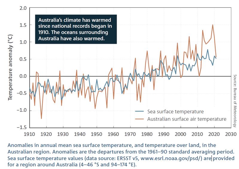
Big Scary Graph according to the Sun Herald. From the State of the Climate Report, 2022.
But it makes sense in a non-scientific kind of way. Government funded scientists would get smaller grants if there was no climate crisis. There are a billion reasons to find “global warming” and none at all to find natural cycles of weather that no one can tax. The hapless researcher who finds that Australia has always been a land of droughts and flooding rains will find themselves sacked for being non-collegial, called a pariah and a climate denier. Just ask Peter Ridd.
This is what we are panicking about?
If the CSIRO and ABC were really serving Australians they’d mention that the best equipment there is shows that Australian temperatures are largely the same now as they were ten years ago. The UAH data is calibrated with thousands of weather balloons released by the very same BoM, but not calibrated (thankfully) with the incompetent thermometers on the ground.
Wow, what a different picture this is?
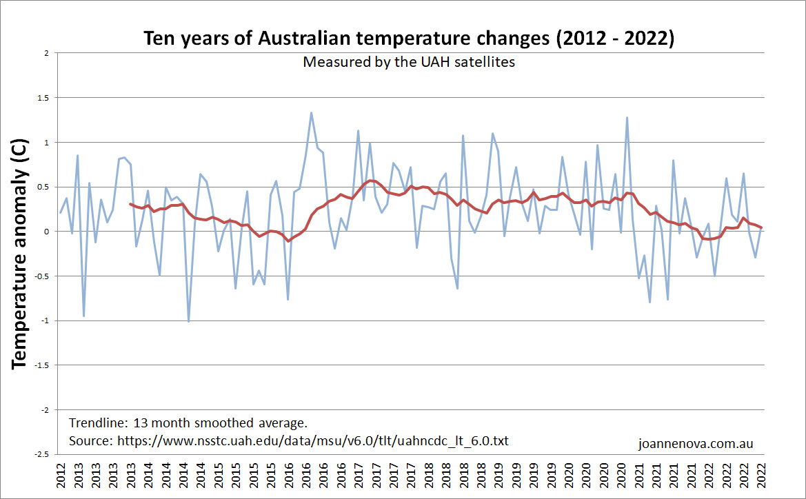
Australian temperature variation as measured by UAH satellites. (2012 – 2022)
In the same ten year period CO2 has increased from to 391 ppm up to 416 ppm. That’s a full 25 additional ppm of the planet-heating-gas yet who could tell?
Part of the global warming seen in the top graph, but not recorded by satellites, is found with expert thermometers like the one in Maitland (SA) pictured here. This thermometer is not part of the official best 100 official ACORN sites, but it has been used to “correct” the data from at least six of those sites. Ken Stewart assessed hundreds of these sites and found many were not compliant with the Bureau’s own guidelines.
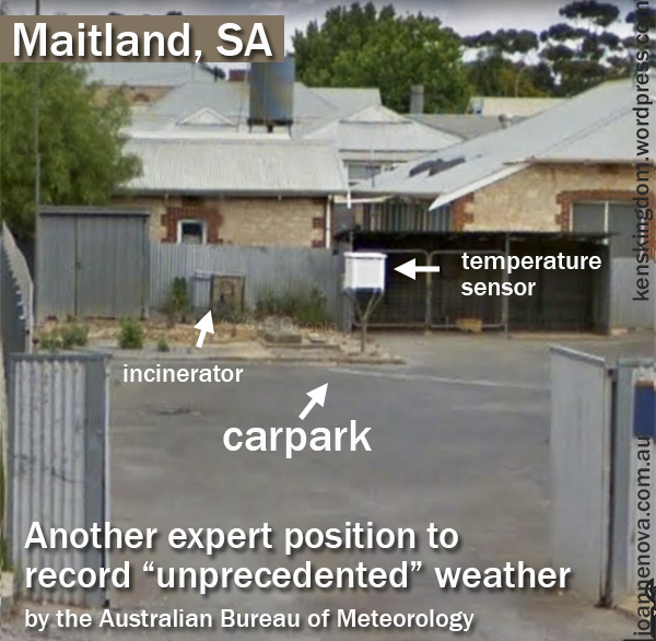
This Maitland thermometer will find global warming. Thanks to Ken Stewart. | Imagery ©2019 Google, Oct 2014.
The same with Streaky Bay. It’s moved to a better home now but for 31 years it too was used to “correct” some official sites from this hot car park.
How concerned were these meteorologists? We’ll spend a trillion dollars buying wind farms before we fix up our thermometer sites and records…
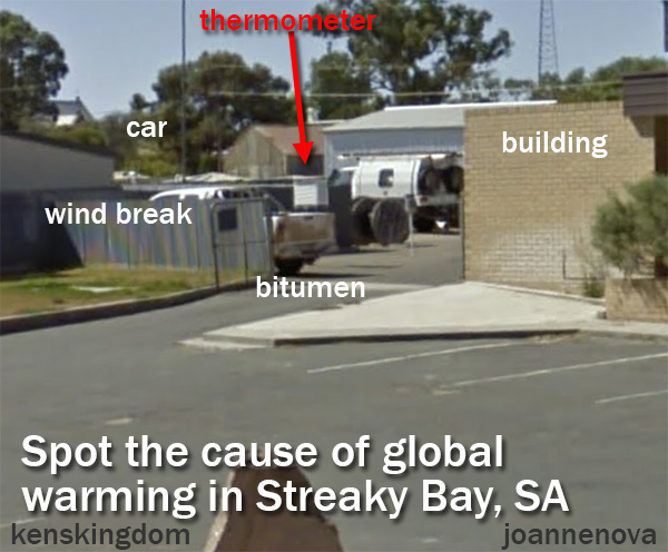
Streaky bay meteorology. More info at Ken Stewarts site. | ©2019 Google. Image Capture Mar 2010.
40% of our man-made warming was in the last eight (flat) years?
Suddenly in the 2022 report the experts are saying Australia has warmed by 1.5°C since 1910. But in 2014 the very same experts said “Australia’s climate has warmed by 0.9°C since 1910”. So the BoM says we are 0.6 degrees warmer now than in 2014 and 40% of our entire century long trend happened in the last eight years. We know the science is settled and all, but according to the satellites Australia is the same temperature now as it was in 2014? (Still, it’s a bit unfair to think all the warming occurred after 2014. With the power of expert adjustments it’s quite possible in the last eight years the 1910’s got colder too. The poor sods of World War I! More frosts than they ever realized…)
This seems a good point to remember those historic heatwaves.
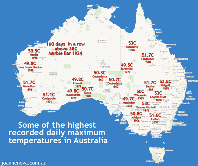
Historic heatwaves. 50 degree temperatures were everywhere, right across Australia in the 1800s and 1900s.|
Oops. The pace of warming has slowed, not sped up
The full satellite record shows Australia has warmed in the last 43 years, but the rate of warming has slowed since 2007 (draw a line with your mind’s eye). Rather than accelerate, as all the Chinese emissions of CO2 filled the sky, the warming in Australia slowed down.
Not what the models predicted. Not accelerating. Not apparently affected by extra CO2.
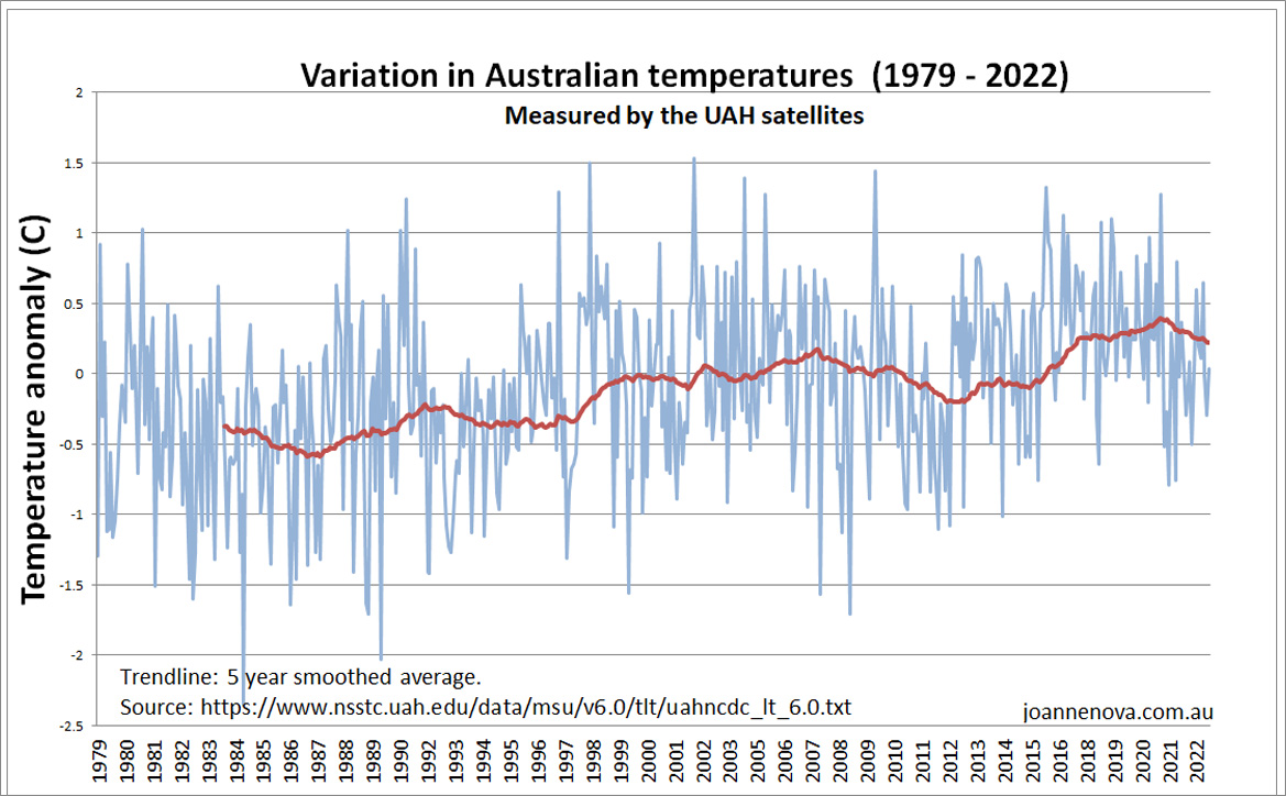
Australian temperature variation as measured by UAH satellites. (1979 – 2022)
Something else, or several other things, are driving our climate and the modelers don’t know what they are.
Finally, here’s a flashback just to remind us of why the UAH satellite system really is the best record of temperatures.
Five reasons UAH is different (better) to the RSS global temperature estimates
-
- UAH agrees with millions of calibrated weather balloons released around the world. RSS now agrees more with surface data from equipment placed near airports, concrete, air-conditioners and which is itself wildly adjusted.
- In the latest adjustments UAH uses empirical comparisons from satellites that aren’t affected by diurnal drift to estimate the errors of those that are. RSS starts with model estimates instead.
- Two particular satellites disagree with each other (NOAA-14 and 15). The UAH team remove the one they think is incorrect. RSS keeps both inconsistent measurements.
- Diurnal drift probably created artificial warming in the RSS set prior to 2002, but created artificial cooling after that. The new version of RSS keeps the warming error before 2002, but fixes the error after then. The upshot is a warmer overall trend.
- UAH uses a more advanced method with three channels. RSS is still using the original method Roy Spencer and John Christy developed with only one channel (which is viewed from three angles).
Lastly The CSIRO budget is $1.2 billion a year and the BOM’s is $300 m. Why is it left to unfunded volunteers to provide the full story?
Hat tip to Neville, RickWill, b.nice. But also thanks to Ken Stewart, Chris Gillham, Lance Pidgeon and all the BOM Audit team.
This article originally appeared at JoNova