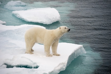
Can the global warming campaign keep scaring us if their predictions never come true?
Check out the featured story this morning over at CFACT’s award-winning Climate Depot news and information service.
Radio and print journalist Kerry Jackson writes that, “It’s summer 2017 and the Arctic was supposed to be ice-free, hurricanes were going to be more frequent and more deadly, and sea levels should be rising alarmingly. Al Gore swore in his 2006 science fiction movie, An Inconvenient Truth, that within a decade there would be a ‘true planetary emergency.'”
“Instead of these disasters, we have the climate alarmist community admitting that there has indeed been a pause in the warming and that its models failed to predict it.”
“Yes, that’s right. The alarmists are acknowledging in the abstract of a research paper that was published this month in Nature Geoscience that there have been ‘differences in model and satellite tropospheric warming rates.'”
This is a big deal.
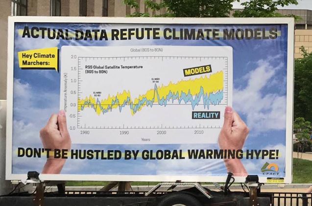
For years CFACT has contrasted real-world temperatures measured by scientists against other scientists’ climate computer models to show that the models project a warmer world than we actually live in.
There has been no meaningful warming since the 20th Century.
Warming campaigners have been in full denial about these inconvenient facts. That they are finally getting around to acknowledging the evidence staring us all in the face is a positive step.
“Admitting you have a problem is the first step to recovery” is what they tell people in crisis.
Let’s hope a begrudging admission that their models have been wrong all along leads to more open minds and better climate science.
Hmmmm That’s odd. The RSS temp that I see shows that last year was lightly hotter then 97-98 spike. This graph doesn’t seem to show that? It seems to show it slightly cooler then the 97-98 year. Wonder why??? Any ideas?? Is it because it would put it right smack in the middle of that yellow “models” aria??
The model predictions are still WRONG!
Just seems like they should include that data in the giant chart with the title “Actual Data Refutes Climate Change.” That’s all. lol
I dont know though… maybe that’s just me!
https://wattsupwiththat.files.wordpress.com/2017/01/clip_image010.jpg
There you go…. I found one at least up to 2017. How come the graph you have in there is missing that big spike in temperatures from last year??
Using 1997/98 as a reference point, wouldn’t that put the blue part of the graph right smack in the middle of that yellow part of the graph???? No ??? Seems like it would.
Boy that’s embarrassing…No wonder its so hard to find these Predictions/Observed charts that include last year.
Irrelevant, the predictions are still wrong!
this report was discredited. NOT peer-reviewed. http://www.snopes.com/climatology-fraud-global-warming/
lol There you go.
https://uploads.disquscdn.com/images/da3302d1935aeff9bbee8f0e991dcee89c0a311a0f7fae4012a2ea5971617e31.png