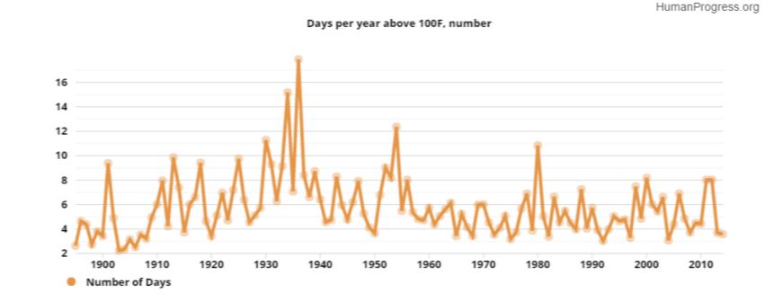
A new analysis of National Oceanic and Atmospheric Administration (NOAA) data published Friday shows 1936 had more days above 100 degrees Fahrenheit than any other year. Recent years don’t come close.
Source: HumanProgress.org
The chart was made using NOAA data from 982 stations aggregated by Dr. John R. Christy, a professor of atmospheric science and director of the earth system science center at the University of Alabama in Huntsville.
Since virtually the beginning of 2015, federal agencies like NOAA and NASA were predicting the year would be the warmest on record due to a naturally occuring El Nino’s, which heat the Pacific Ocean up.
Claims 2015 is the warmest year on record ignore satellite data, which shows 2015 only ranks as the third-warmest year on record.
Send tips to andrew@
This article originally appeared in The Daily Caller
That must be why I feel the cold, I was born in the hottest time, June 1936. Looking at the peaks since 1936 to 2000 I see a decline in the annual number of hot days suggesting its getting colder, I would like to have seen it projected another 14 years.
You were duped. Not surprising at all.
Best,
D
Your assertion, You never did explain the CO2 mechanism, so obviously what you are unable to explain is beyond your pay grade. Shame!
You are making it up. Already explained it to you. Not my fault your capabilities lacking.
Best,
D
Never your fault or responsibility is it? Explain the CO2 Mechanism for late comers. Why miss out on an opportunity ?
You lack capacity to grasp that I already explained it to you, by using small words and typing slowly.
Best,
D
Click on the source sited in the second line of the article. It will give you the full plot that got truncated in printing. It is a plot of data not a projection and it simply shows the preponderance of hot days in the record to date were in the early 20th century. It implies that the recent high temperature years are the result of increased minimum temperatures.
I for one do not fear slightly warmer nights or winters.
Thanks I just copied it for reference.
Is the author trying to look
silly?
Do i even have to point out to
readers the unmentioned cherrypick?
Not even mentioned on the chart!!!
Hows that for deceit.
Admit it whatyername?
Andrew Follet. Ya not giving ALL
the RELEVANT detail are ya.
@Li D: No, he isn’t. Are you?
Care to attempt to describe what it is that you do not understand? Or is that too difficult?
Evidently, you have swallowed the unscientific bilge that passes for human-induced climate change.
If the last 30 years have brought the planet unprecedented warmth, how is it that the all-time recorded high temperature records for all continents were set in the 19th and early 20th centuries, well before human activity’s CO2 reached levels that alarmists claim are causing climate change?
The Antarctic record was set in 1974, during the time when global cooling was the big concern (and many of today’s warmist scientists were blaming human activity back then, too). But you have to remember, nobody was monitoring Antarctic temperatures in the 19th and early 20th centuries. And, by the way, Antarctica’s all time low temperature record was set in 2004, when the planet, according to alarmists, was boiling, thanks to human emissions of CO2.
I suggest you acquaint yourself with natural climate change as revealed by the geologic proxy record. You would soon discover that current climate is far cooler than Earth’s normal climate. The rest is up to you to discover if you are serious about understanding climate change and that it is entirely natural and that humans have no ability to significantly impact climate. None.
describe what it is that you do not understand? Or is that too difficult?
That’s good comedy! I LOLzed!
Best,
D
You are unable to explain what you believe, that can only mean that you don;t understand it yourself.
You’re a one-note little pony who hopes no one remembers it was explained to you and you looked at it, jaw agape.
Best,
D
By golly this is tedious bullplop.
If you reckon cherry picking
one small part of
the globe ( but not mentioning
this ) , and presenting it as
” most hot days ”
is a frank, candid presentation of
data then you dont really get
science or journalism.
I know many ( not all ) americans
have an exceptionalist outlook
politically, but that MUST NOT
extend to science and the
display of science data.
Any small child can understand
USA temps are not global temps.
Please explain why the chart and
author neglected to mention
WHERE GEOGRAPHICALY the
data comes from.
Such information is vitally important for accurate comprehension of the data.
This is a cyclical argument without a solution, namely, what to measure, how to measure and where to measure.
These poor saps can’t grok it.
Best,
D
” grok ”
Do you mean grasp?
If so i agree.
It’s from a Heinlein novel, to understand completely and thoroughly.
Best,
D
Great, so explain how the CO2 molecule is responsible?
Already did so.
Best,
D
But you don’t understand the CO2 mechanism, otherwise why not debate it Dano?
You lack capacity to grasp that I already explained it to you, using small words and typing slowly.
Best,
D
Understanding natural climate change should be the first step a scientists takes before trying to determine (a) whether current climate is unusual, and, (b) if there is evidence current climate is unusual, what possible causes exist that should be explored.
But that isn’t what was done, which is obvious from both the geologic & ice core records of past climate change as well as the more recent human-recorded data. Instead, it was just presumed that humans are to blame for what turns out to be unremarkable climate warming since the Little Ice Age. There is no legitimate basis in science to claim human activity has a measurable impact on global climate. None.
Yous were duped on this charts. Why?
Best,
D
You were duped full stop.
o Scientists have ignored all natural processes and just “assume” the warming is anthropogenic, 15+ if scientists don’t consider the sun [10 points]
o Humans cannot change the earth [10 points]
https://www.facebook.com/ClimateDenialistTalkingPointGame
Best,
D
Clownical assertion. Young Andrew needs a few more classes in disinformation. When is Heritage holding the next seminar to enroll this poor lad?
Doesn’t even pass the laugh test.
Best,
D
You are a embarrassing idiot paid to troll.
What’s embarrassing is your utter and total inability to address a single byte of anything I typed.
Best,
D
Data from all parts of the world show the same thing, the 30’s was warmer than any decade since. Globally the temperature has fallen since the 30’s, there’s no doubts. Throw as many fake graphs on the table as you wish, reality doesn’t change ..
http://www.inquisitr.com/1234575/nasa-scientist-global-warming-is-nonsense/
Waaaaaah.
Man, that Woodcock bloke!!!!
Tell me RJL, do YOU reckon
theres ways of telling CO2 content?
And if there is, would they be measuring an increase in the last
100 years or not?
If not why not?
Wheres it all going???
Or are the coal production stats a
lie too!!!
Surely the coal mob aint in league
with the USA Navy and NASA and
the UN in some fucked up commie
plot too! Not the coal mob!
Which leaves one wondering where
all the power in the grids is coming
from.
No CO2 increase. What a fucking
bufoon.
As we know from many places CO2 level follow temperature. Here’s another way we can say for sure the 30’s was a lot warmer than today, worldwide!
https://roaldjlarsen.wordpress.com/2015/08/25/co2-level-in-history/
CO2 level in the beginning of the 40’s was way above todays level, in fact it was over 440 ppmv (today only 400 ppmv) in periodes.
Roald. Can you help me with question pertaining to one of the graphs in your link? I am looking at the Phanerozoic CO2 vs Temp chart.
The temp anomalies on the right are shown with a baseline of zero. But what is the baseline and what is the significance of showing temps above and below the baseline? Do temps at the baseline (0 degrees) correspond with CO2 at 3.000 ppm? What is the significance of that?
Any help that you can offer would be appreciated. A link to an article on how to read a climate chart would be helpful. Thanks.
Baseline is supposed to be today’s average, global temperature, i write “supposed” because we don’t actually know. But in order to have a way of measuring it, this is what they came up with. Average temperature is about 14,5 C. Most of earth’s history it’s been a lot warmer, around and even over 21 C. In fact life evolved during a much warmer climate with a lot more CO2 in the atmosphere than today.
The 3000 ppm on the far left side is not tied to the temp-baseline. It’s just a visualization of two different types of data on the same chart.
Thanks very much. That helped a lot.
CO2 level in the beginning of the 40’s was way above todays level,
[citation needed]
No running away in craven haste.
Best,
D
Damn straight citation needed.
Its the most astonishing
statement.
Still, one never knows.
The enormous communist
climate conspiracy could yet
be undone by a small plucky
band of billionaires and oil
companies.
( oops, getting a bit conspirital
there. Only said it cuz its funny!)
Im nearly tempted to look
for a CO2 air sample taken
by an oil company in the forties. I gather that would
be trustworthy.
Unlike the samples taken by
every other science organization on the planet.
Betcha the USA military has
got its own records too.
Maybe they were part of
the climate communist conspiracy too!
In the 1940s!
Lol.
I tracked down the crap about
fourties CO2.
Craaaaap.
Anyone can do it in a few
minutes if they have interweb
access.
Careful CFACT readers!
You might end up on some
dastardly science based webpage. It could even be
outside USA.
oooohh computer cooties!
In fact life evolved during a much warmer climate with a lot more CO2 in the atmosphere than today.
Irrelevant. And ignorant of biology, botany, oceanography, glaciology…
Best,
D
CO2 level in the beginning of the 40’s was way above todays level,
[citation needed]
And CO2 has been leading temperature since the Industrial Revolution.
best,
D
No it has not! Temp increases and Co2 follows years later. Some think its warming Oceans releasing CO2 which is logical. As is the plants growing and decaying releasing the same CO2.
Temp increases and Co2 follows years later.
Oooper doopers. Doesn’t grasp what’s happening today.
Best,
D https://uploads.disquscdn.com/images/f5cf43a30f7ed526fe2ee459131f98c9f4c83c5e62ef9df076d79b6e5d1e4535.gif
Your only upvote has been the Dano Clown.
I dont know what an
upvote is.
Is that like them wanker
facebook like things?
Means fuck all to me.
Data from all parts of the world show the same thing, the 30’s was warmer than any decade since.
You were duped. Why? Why are you so easily duped? For our entertainment?
Best,
D
I have an article about this topic https://logiclogiclogic.wordpress.com/2016/01/21/48-inconvenient-truth-nytimes-lies-2015-wasnt-the-hottest-year-on-record/
I agree that the 30s seem appreciably as hot as current temperatures. In fact other things which haven’t happened during this “hot” period like the dust bowls and the opening of the northern passage make one question if the 30s was indeed hotter. We also have evidence from the arctic poles that is pretty unequivolcal that at least the poles were hotter in the 30s than today. All of this happened with CO2 at 280 or so.
What is an average? I also found that all through the 30s and some of the 40s temperatures were far higher than even today. I don’t know if those extremes we saw in the southwest were as bad in other places but we know that most of the US and arctic were very hot.
There was also a period about 60 years earlier when temperatures again were hot enough for people to really notice. They talked of arctic heat waves that made all the ice melt. Before they will convince most of us that the 30s and the rest of the century was basically a straight line going up in sync with CO2 they are going to have to explain these discrepancies in the record.
What you fail to understand is that the 1936 ‘hottest days’ were only in the U.S. which comprises only about 2.6% of the planet’s land mass. They broke records in the U.S. ONLY while the rest of the world was, on average, MUCH COOLER then than now.
1936 was certainly a hot summer in the U.S.! July has been cited and the hottest July on record, BUT ONLY IN THE U.S.! The rest of the planet was, on average, significantly COOLER than in recent years.
2015 was the third warmest on record at the time of this article while 1936 has been ranked well below 40th in the WORLD.
Don’t fall for deceptive ‘reports’ like this!