I have been advocating for an overhaul of the Saffir-Simpson scale since 2008. The inspiration for this came indirectly from Bill O’Reilly. I was on his show the night before Hurricane Ike hit Texas, when the storm was downgraded from a Category 3 to a Category 2, prompting his comment: “So this won’t be so bad.” As we all know, Ike was devastating. O’Reilly, like most people, did not know about the weaknesses of the Saffir-Simpson scale. The problem with the Saffir-Simpson scale is fourfold:
- A monster storm like Ike does not simply drop from a Category 3 to a Category 2. It might go from a 3.02 to a 2.98, as Ike essentially did, but the difference in damage caused by a 15 mph wind speed reduction from 109 to 95 mph is immense. However, distinguishing between 111 mph (Category 3) and 109 mph (Category 2) is challenging. This shows the scale is flawed.
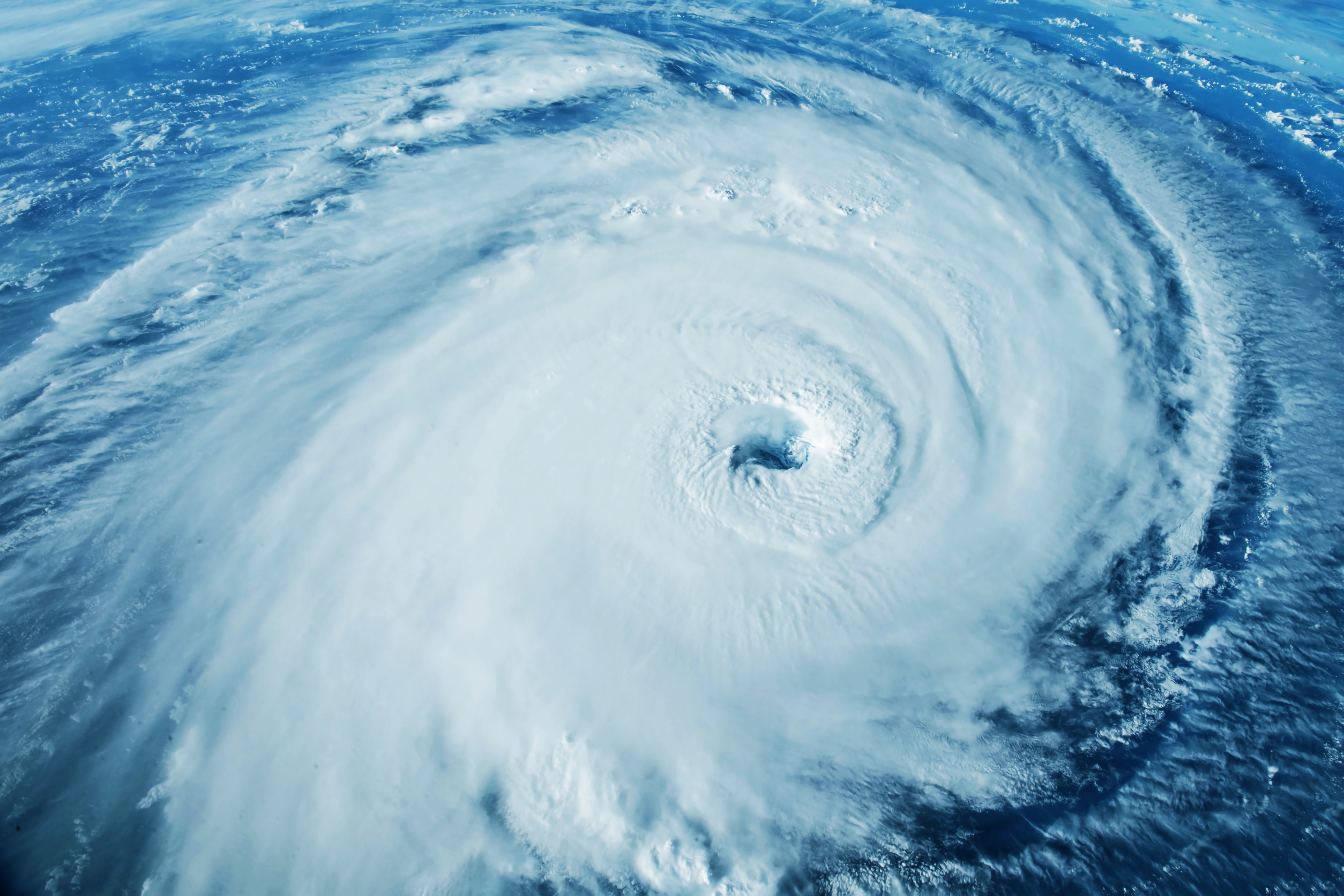
- The size of a storm matters in terms of its cumulative energy. This is especially true for large storms that push significant water ahead of them. For instance, the great 1962 Mid-Atlantic storm was non-tropical and had winds below 60 mph, but its large area of gales caused substantial water pile-up. Hurricane Sandy and Katrina are classic examples. How could Category 3/4 Katrina produce a surge as high as Category 5 Camille, and over a larger area? While Katrina’s winds at the center weakened, making it a “Category 3,” its total cumulative energy exceeded that of Camille, a smaller storm. Even the National Hurricane Center acknowledged in a blog last year, “Size Matters.”
- Pressure tendency is an additional metric. I contend that a rapidly intensifying storm channels a high amount of wind to the surface due to favorable development conditions. Conversely, a weakening storm does the opposite. A prime example is Hurricane Idalia in 2023, which the National Hurricane Center insisted was a major hurricane at landfall, despite no storm chaser I know believing it was stronger than a Category 1. No observations recorded gusts over 90 mph, let alone sustained winds of 111 mph or more. The storm was weakening rapidly, so depending on the rate of weakening, we could add or subtract from the total score. Previously, I waited to incorporate the raw score of the five essential parameters (described below), but I now believe including pressure tendency as an additional metric added to the end of the six metrics is enough.
- An objective test is needed to assess whether storms are truly worsening. This counters climate hysteria, claiming conditions are worse than ever, as people fixate on storm categories rather than the full picture. My power and impact scale avoids rapid category swings by incorporating more metrics.
I have been sharing this approach with clients, WeatherBell subscribers, and social media followers for years. The idea emerged in 2008, and in 2011, when I joined WeatherBell.com, I had the freedom to develop it further while identifying areas where Accumulated Cyclone Energy (ACE) would exceed 50% of the season’s average or fall below normal. The total number of storms is a secondary issue to me; impact is what matters most. Understanding the hemispheric pattern and recognizing that the global tropical cyclone season is a byproduct of it is crucial not only for tropical forecasts but also for grasping the broader weather pattern. This is why the Madden-Julian Oscillation (MJO) is vital to me, as tropical features significantly influence the entire pattern.
I am writing this now because someone in academia is finally addressing this issue. I am reviewing the evolution of my idea to show it originated in the private sector nearly two decades ago. A man-made global warming skeptic like me is unlikely to be heeded by agencies with substantial funding that push man-made global warming narratives (NOAA, not the National Hurricane Center, which I believe operates with integrity regardless of their views). When, not if, the scale is updated, we will know who said what and when.
By the way, reanalyzing storms using this scale would be a worthwhile investment for the National Hurricane Center. It would likely debunk the notion that activity is worsening just because Category 5 storms are appearing. If those pushing this narrative examined the Western Pacific and Indian Ocean, they would understand why we are seeing these patterns. Distorted warming has spread out the main development regions, leading to more small storms developing further north. Under the right conditions, rapid intensification occurs, but these storms are also further north. This ties to the overall spreading of heat, with greater warming in the north than in the tropics and a weakening Hadley cell. If we consider the global picture, the Western Pacific, which accounts for nearly 60% of the Northern Hemisphere ACE, has had only two above-normal years in the last 20, signaling a significant change. While people focus on our seasons, more people live in the path of typhoons than hurricanes, which is a positive. However, as usual, arguments in the politicized sewer of climate and weather rely on propaganda tactics, highlighting partial truths while ignoring the full picture. To demonstrate my objectivity, consider this year: despite storms staying offshore but in our red zone, the Carolina beaches have taken a pounding. Yet cherry-picked narratives claim the season is underwhelming. This is dangerous, given the distortion I’ve described, which has led to active major late-season (after September 15) hits over the past decade. If I were on the other side, arguing it’s worse than ever, I could point out that this is only the third time since 1900 that the first three hurricanes of a season reached major status. We nearly had four in a row, but Imelda fell short.
Meanwhile, no one highlights the most remarkable non-signal: the Western Pacific is again well below normal, with one of the lowest ACE-to-storm ratios on record and only one super typhoon when the average is eight or nine. This is overlooked because the focus is on scoring political points rather than understanding the full picture.
Now, let’s examine the Power and Impact Scale we have developed.
This is the latest version; the first version appeared in 2011.
6 metrics form the base of the scale:
Saffir Simpson SLP
Saffir Simpson Max wind
Max wind gust
Extent of 64 kt wind. Total of all quadrants divided by 100.
Extent of 50 kts wind. Total of all quadrants divided by 150.
34 kt wind. Total of all quadrants divided by 200.
SLP pressure addition or subtraction to the total above based on 12-hour tendency.
Divide by 6.
The major hurricane starts at 2.5, and we can get categories that are higher than 5 because we used tenths. Very tough to do since the storm would have to be quite large in wind extent.
So I respect the Saffir-Simpson scale and use pressure and wind as an input.
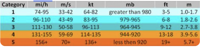
But crucial to this is the idea of tenths. For instance, if you have a storm with a 985 mb pressure and 90 mph winds, the pressure category gets a 1.7 and the wind will get a 1.7. So, they are added up. You also respect the gusts. The storm, just using the Saffir-Simpson this way, would be a 1.7, not a one — and it should be, because its metrics are closer to 2 than 1.
We also have a gust category.
So again:
The 64 kt wind extent score is the total divided by 100.
The 50 kt wind extent is the total divided by 150.
The 34 kt wind extent is the total divided by 200.
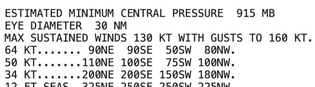
So, let’s take Katrina before the first landfall:
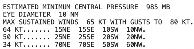
Sea level pressure is 1.7, max wind is 1, and gust is 1.8.
64 kt wind extent 1.
50 kt wind extent is .6
34 kt wind extent is 1.3
That total gives us 7.4, but the pressure fall of 15 mb in 12 hours adds .75 ( rounded to 8).
So, the total score is 8.2, divided by 6.
Katrina’s first landfall on the power and impact scale was rounded, 1.4.
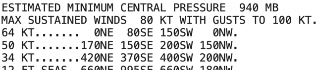
What about the max intensity on Sunday before landfall?
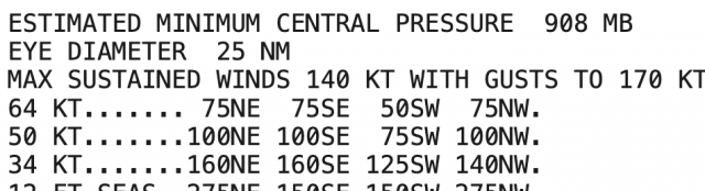
Slp gives us a 5.4 (that’s right, you can go over 5).
Max winds give us a 5.2
max gusts gives us a 5.8 ( 200 is 6)
extent of 64 kt winds 2.8
extent of 50 kt winds 2.5
extent of 34 kt winds 2.9
30 mb pressure fall in 12 hours adds 2.5
So, the total 27.5 divided by 6 gives us 4.6. (The smaller radius of strong winds is limiting it)
How about landfall?
SLP 5.2
Max wind 4.8
Max gust 5.6
extent 64 kt wind 3.1
extent 50 kt wind 3.1
extent 34 kt wind 3.7
Raw score is 25.5, but there was a 10 mb SLP rise in 12 hours, so we take .5 off.
25 divided by 6 gives us 4.2.
You need these metrics to quantify the total power of the storm. It’s not a hard concept. People may think, “Wow, this is too complicated.” But think about it. How much damage did Katrina cause? $125 billion.
What was the total damage from Sandy? $68.7 billion, seventh costliest on record. That is due to the large area of high wind and its energy driving so much water into the coast. Given the idea that every category the damage increases tenfold, how is a Cat 1 on Saffir-Simpson scale only half as costly as Katrina? It should be much, much less costly. But if we dig into the power and impact scale, you can see why.
So, what was Sandy at landfall?
SLP was 4
Max Sustained winds. 1.6.
Gusts 2.9
extent hurricane winds. 2.3
50 kt winds 5.5
34 kt winds 7
Wow. Look at those last two. Do you realize how much energy is involved in producing that, and what impact it has on raising the ocean?
total: 23.3
So Sandy was a 3.9 on the scale.
And why not? Look at the extent of that wind.
So, think about how Sandy was a Category 1 on Saffir-Simpson, and Katrina, with her first hit, also a Category 1? Which storm — using a scale with more metrics — would indicate who had the most power and therefore the greater impact? Suppose the levees had held in New Orleans; then Katrina’s damage would likely have been less, and just a bit over Sandy’s, with Katrina’s second hit. Notice how the power and impact scale would have led to that conclusion in the first place.
So this is the updated scale, which I have been working on since 2008. Other categories may be added (storm surge, for instance, which responds to the wind and coastal variations). Rain has to be separate, since it involves non-wind parameters.
So that is where this stands now. By including more metrics like this, you get the total picture of the entire storm, not just a snapshot at the center. The public does not have to get into the weeds with the parameters; they are smart enough to figure out tenths and understand that we are describing the total storm. By developing a database with this, you can better inform people about what to expect relative to past storms. And though it should not be a consideration, in this day and age it has to be; it will form a basis of objectively looking at storms and removing the cherry-picking that is done to make points that don’t show the total picture.
Like I said, there is no way a man-made global warming skeptic will be involved with the final scale despite pushing this for so long. But it’s been out there for anyone to see.
For me, it’s composing a song no one will ever hear, but you do it anyway out of love and gratitude.